SACRAMENTO KINGS REDESIGN
Brand Identity / Brand Strategy / Design System
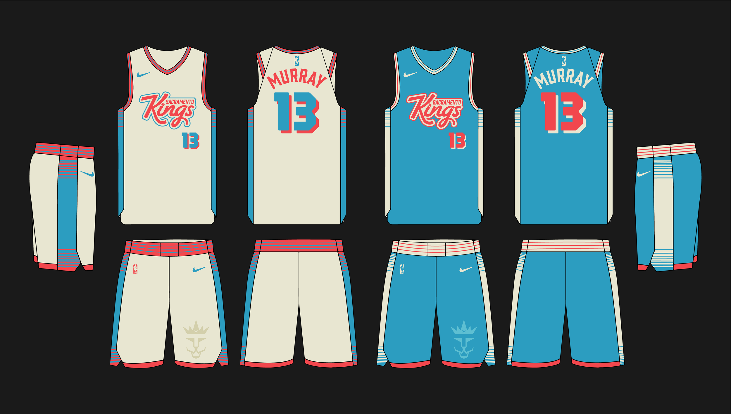
For this self-initiated project, I reimagined the Sacramento Kings' branding by drawing inspiration from their original 1971 red-and-blue color palette. My goal was to revive these iconic colors while honoring the franchise's current logo and identity. The redesign places the crown—a symbol of royalty and strength—at the forefront, creating a bold centerpiece that bridges the team’s storied past and dynamic present.
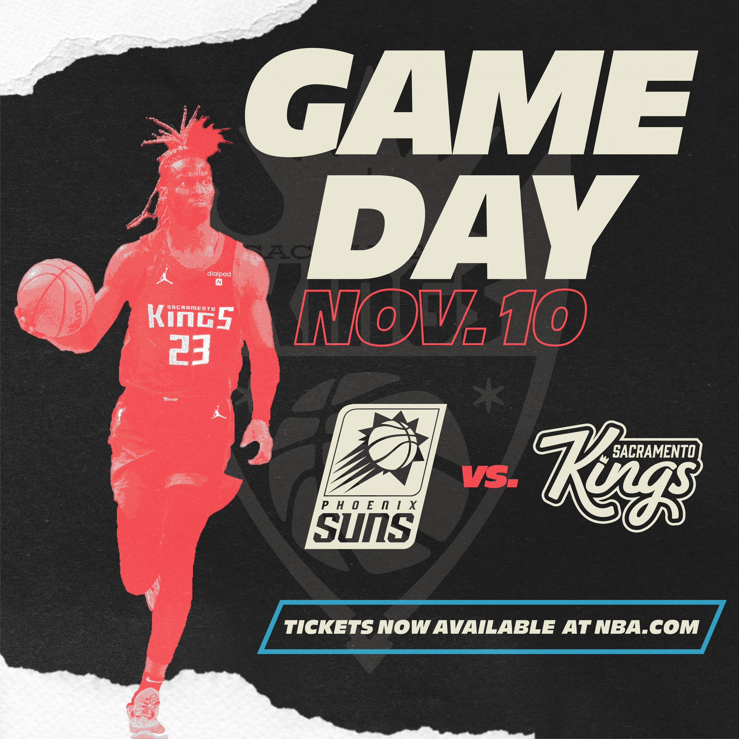
The updated logo balances modern aesthetics with a deep appreciation for the Kings' history. Beyond the logo, I extended the rebranding across multiple touchpoints, ensuring a cohesive and elevated brand experience. This includes a redesigned website homepage, social media graphics, and t-shirt merchandise that connects with fans. I also developed home and away jerseys that integrate the refreshed colors and logo, as well as a new basketball court layout to align with the team's revitalized identity.
This project allowed me to explore the intersection of sports design, branding, and merchandise, blending tradition with innovation to create a cohesive and memorable visual identity for the Sacramento Kings.